Client
Only Child
Brief
Create an identity for a playful single-origin coffee brand that takes the pretentiousness out of coffee, while also standing out in a crowded market.


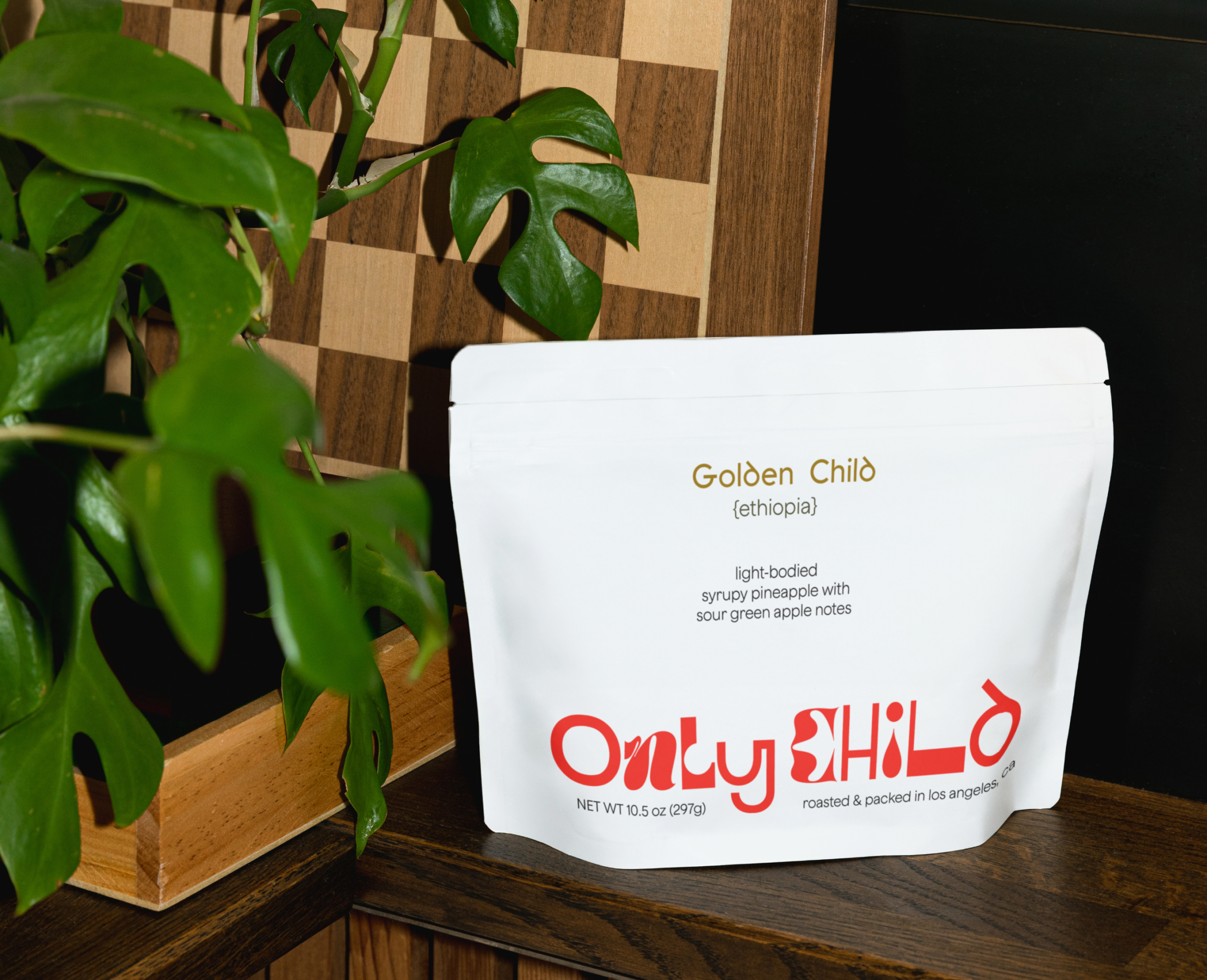
Logo
The logo is made up of a variety of letters of all shapes and styles. Some are bold and rigid, others curvy, playful and flexible; but they all come together to create something unique and harmonious.
They fit together just right and reflect the many facets inside of our brand, we aren’t just one thing.


Color Palette
This color palette is bold and not to be ignored. Here we’re reimagining a childish color palette of pinks and blues and turning it on its head with super vibrant alternatives, cheekily named after different personality traits.

ONLY CHILD
ONLY CHILD

Subheading
Typeface: Jokker
Heading
Typeface: Gerbil
Body
Typeface: Jokker
Typography Palette
This typography palette is comprised of two great san serifs. Gerbil, giving us the personality filled headings, but not too much to compete with our logo; and Jokker, a more demure and condensed font that grounds the brand.