
Client
Techo Park
Brief
Techo Park is a co-working space that caters to remote creatives looking for offline community. The brand logo and feel must reflect the futurism of the internet, while feeling grounded and serene.

Logo
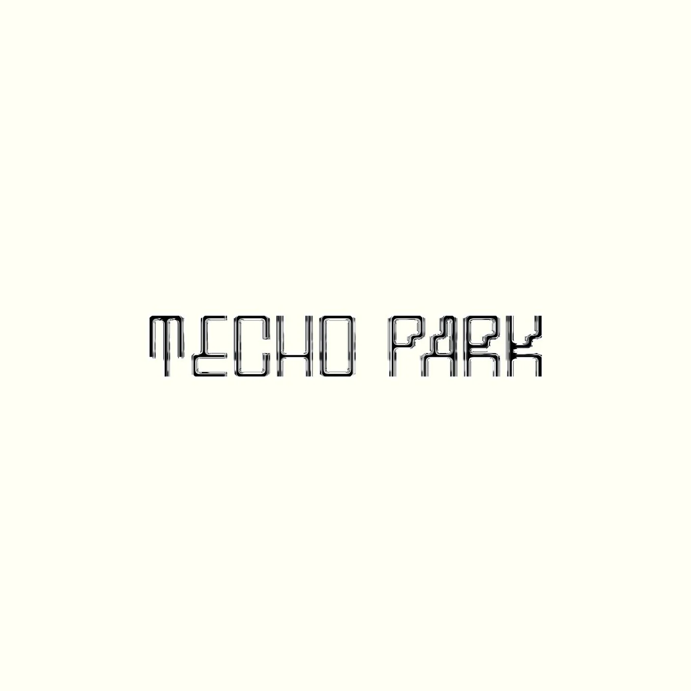
A digital-inspired font with a chrome face signals that Techo Park is a place for online creatives. It values a design-forward audience and feels professional yet approachable.

Color Palette
This color straddles the real and digital worlds with bright digital yellow and green. Playing with these accents in addition to black and white neutrals keeps the colors in stark, bold contrast.


Graphics
We use these graphics to further our visual language. They add more modern and a grounded energy to the brand.
Online World
This lined globe symbolizes the connectivity of the online space. Techo Park caters to professionals who are working remotely, globally but want that local connection as well.
Local Palm
The palm tree, squiggled like our font represents the local half of Techo Park. While your real coworker may be on the other side of the globe, your peers are in Los Angeles and another kind of work community to tap into.


TECHO PARK
TECHO PARK


Subheading
Typeface: Khand
Heading
Typeface: SK Cynic
Body
Typeface: Khand
Typographic Palette:
SK Cynic is a highly stylized font taken from the logo and paired with Khand a san-serif that feels similarly retro-futuristic yet grounded. The type combination works to evoke a sense of digital play and paired with the nature visuals, it encompasses the core ideals of Techo Park.

